


Why Africa’s True Size Is Causing A Global Map Debate
For generations, millions of people have grown up looking at the same world map without ever stopping to ask a pretty obvious question: does the map actually show us how big these places are? Now that question is at the centre of a global debate, and Africa is right in the middle of it.
On September 4, 2026, the United Nations General Assembly overwhelmingly backed a resolution encouraging governments, schools, international organisations and technology companies to use map projections that represent the relative size of continents more accurately. The resolution was supported by 164 countries, while six abstained and the United States was the only country to vote against it. The initiative was led by Togo on behalf of the African Group and backed by the African Union, making it an important moment in Africa’s push to change how the continent is represented on maps.
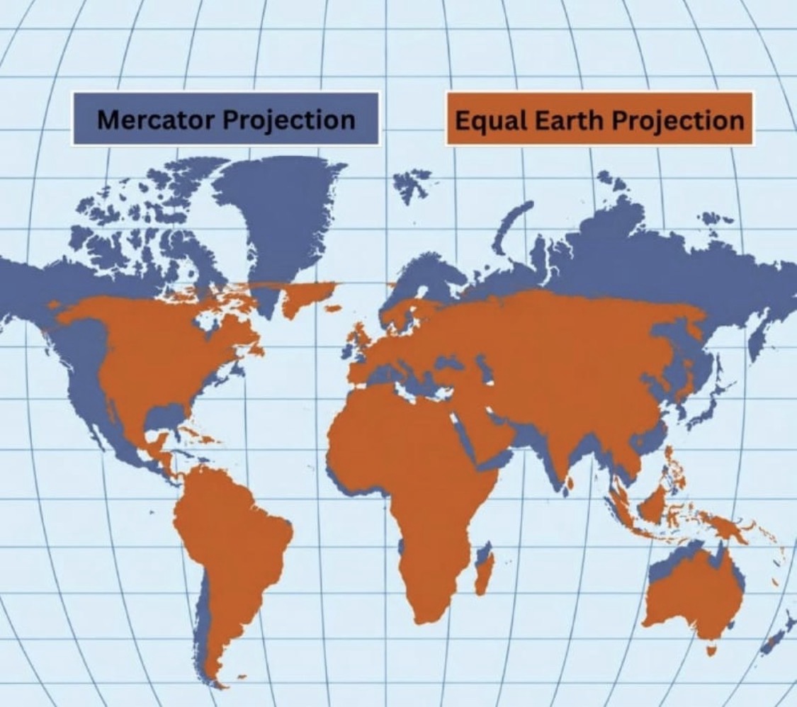
The debate centres largely on the Mercator projection, the familiar world map many of us saw in classrooms growing up. Created by Flemish cartographer Gerardus Mercator in 1569, it was designed primarily for navigation and is useful for maintaining directions, but it dramatically enlarges landmasses as they get farther from the Equator. Countries and regions in the far north therefore appear much larger than they actually are, while Africa and other areas closer to the Equator appear relatively smaller.
The Greenland comparison is probably the easiest way to understand just how dramatic that distortion can be. On a traditional Mercator map, Greenland can appear almost comparable in size to Africa, even though Africa covers about 30.4 million square kilometres and Greenland covers roughly 2.2 million. Africa is therefore about 14 times larger than Greenland.
And Africa is not simply bigger than Greenland. It is an enormous continent that can completely change the way you think about the scale of the world. Africa covers more than 30 million square kilometres and is larger than the United States, China, India and much of Europe combined in commonly used geographical comparisons. The continent stretches thousands of kilometres from north to south and east to west, with 54 countries, enormous deserts, rainforests, mountains, rivers, lakes and some of the world’s largest cities. Africa did not suddenly become bigger because people are looking at a different map. It has always been this size. The difference is that some map projections make that reality much harder to see.
The projection receiving much of the attention now is called Equal Earth. Developed in 2018, it is an equal-area projection designed to preserve the relative sizes of continents and other land areas much more accurately. That does not mean every country will look exactly the way it does on a globe, because no flat map can perfectly represent a round planet. Every projection involves trade-offs involving area, shape, distance or direction. Equal Earth simply places greater emphasis on preserving relative land area, which is why Africa looks much closer to its actual scale.
For Africans, this debate goes beyond geography. It is important not to claim that the Mercator projection was deliberately created to make Africa look small, because that would be historically inaccurate. Mercator’s projection was developed for navigation, not as a scheme to diminish Africa. At the same time, the visual effect of the projection is real, and generations of people have learned about the world through maps that make Africa appear smaller relative to regions farther from the Equator.
That matters because maps do more than show us where countries are. They also help shape how we understand the world around us. A child growing up in Cameroon, Nigeria, Ghana or Kenya should have an accurate sense of the enormous continent they live on, just as an African child growing up in France, Britain, the United States or Canada should have an accurate picture of the continent connected to their heritage.
The United States was the only country to vote against the resolution, but it would be misleading to frame that as America voting against Africa’s actual size. The U.S. opposed the resolution on ideological and policy grounds, arguing that the initiative was an inappropriate use of the UN’s attention. The resolution itself does not ban Mercator, nor does it require every map in the world to be replaced. It is nonbinding and encourages the use of equal-area projections such as Equal Earth when accurately comparing the size of land areas is important. Mercator also remains useful for navigation, which is one of the reasons it was created in the first place.
So, no, Africa did not suddenly get bigger this week. The continent was already enormous. What has changed is the conversation about how we represent that size and what those representations teach us about the world.
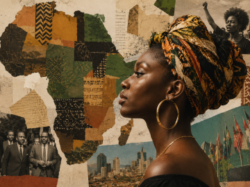
For Africans and the diaspora, seeing Africa represented closer to its actual proportions can be more than an interesting geography lesson. It can challenge assumptions many of us absorbed without ever questioning them and remind the rest of the world that Africa is not a small region sitting below Europe on a classroom map. It is a vast continent with 54 countries, extraordinary geographical diversity and a landmass large enough to put the scale of several other major parts of the world into perspective. The map is not making Africa bigger. It is helping more people see how big Africa has always been.
Discover more from The HotJem
Subscribe to get the latest posts sent to your email.